Untitled - Modern crypto trading platform
Designing a modern crypto trading platform that proves powerful financial tools can be fast, clear, and genuinely enjoyable to use.
What if crypto trading didn't have to feel this way
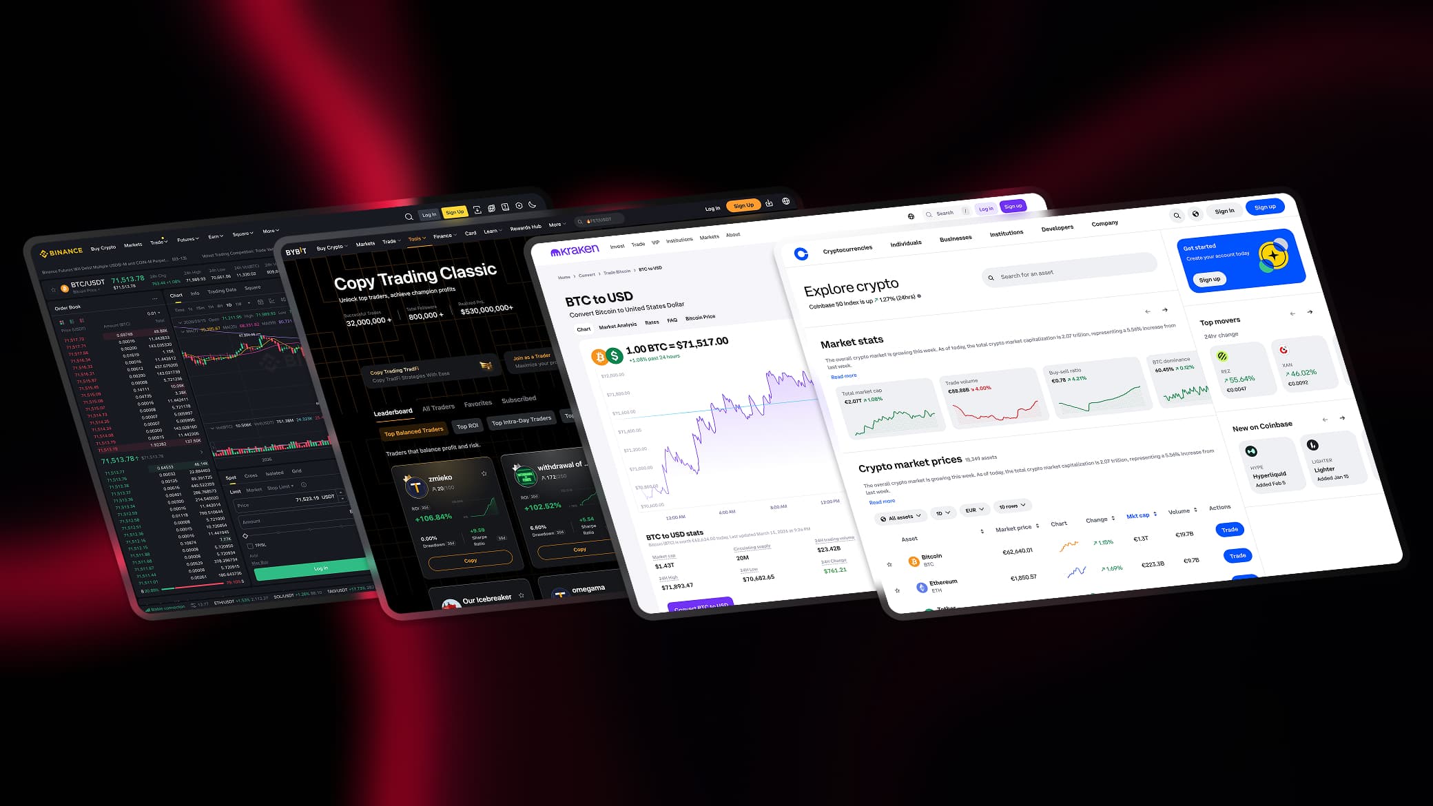
Every major exchange carries the weight of its own history. Features piled on features. Interfaces that alienate everyone except power users. Visual languages that feel more like internal tools than products designed with intention.
Untitled started with one question: what would a trading platform look like if built from scratch today, with no legacy constraints, no clutter, and no assumption that complexity is unavoidable.
What the market gets wrong
Binance has over 400 features. Coinbase limits depth to stay approachable. Kraken offers power wrapped in an outdated interface. Bybit and KuCoin follow the same formula: pack everything in and let the user figure it out.
The result is the same across all of them. A trader opening a terminal for the first time sees dozens of panels, dozens of numbers, and no clear sense of where to start or what matters most.
Untitled approaches this differently. Every panel has a purpose. Every piece of information earns its place on screen. The terminal shows what a trader needs at the moment of decision, not everything the platform is capable of. And the marketing pages sell through the product itself, not through feature lists. Less noise. More signal.
A visual language built for confidence
Most trading platforms default to blue and green. Safe, neutral, forgettable. Untitled takes a different position, building a visual identity that feels alive and purposeful rather than clinical and dated. Every color, every typographic choice, and every decorative element was selected to reinforce one feeling: this platform was built for people who take trading seriously.
Nothing exists without a reason. Each element serves the trader's decision.
Critical numbers always organized, always easy to find.
Security badges and verified labels built into the UI, not hidden away.
Same logic applies across every screen. Homepage to terminal, never feel lost.
Built as an ecosystem, not just a terminal
Most exchanges grow by adding features to a single interface until it becomes unmanageable. Untitled takes a different approach. Each capability gets its own dedicated space, optimized for the user who needs it most.
Swap, trade, earn, track. Each product accessible independently without forcing users through a single flow.
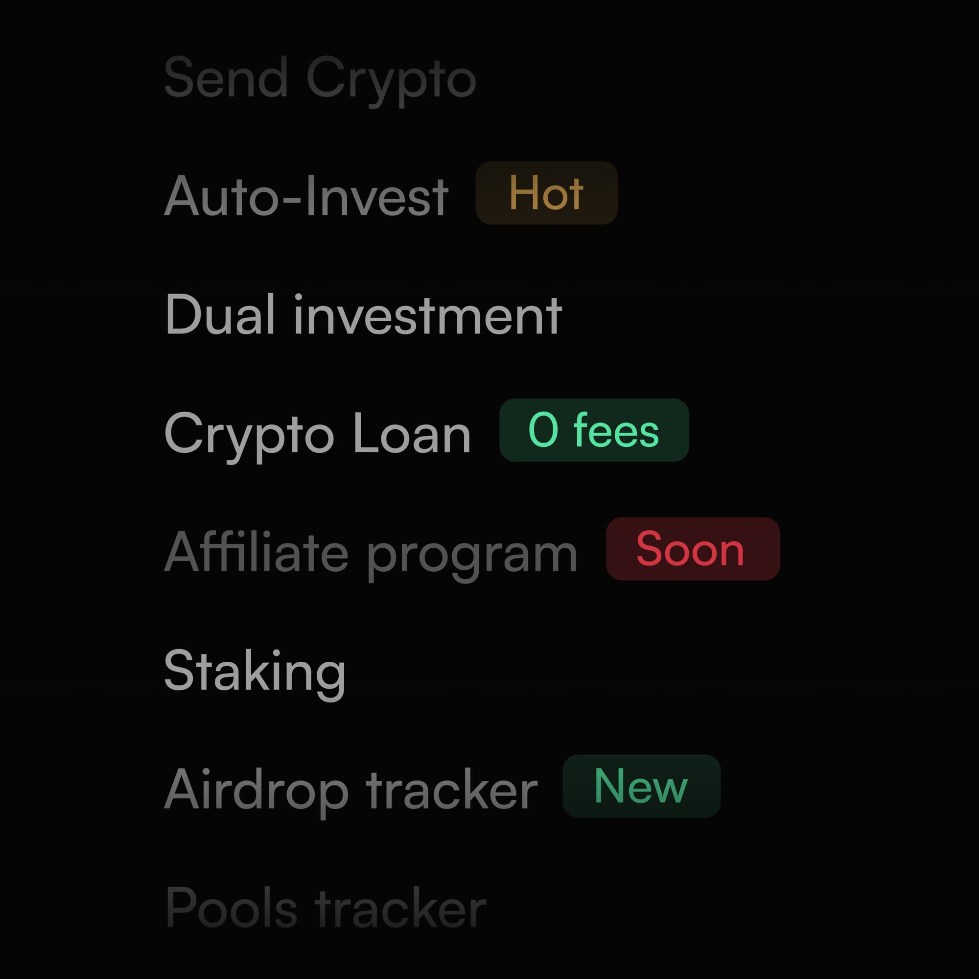
Hot, New, Soon, and 0 fees labels communicate product evolution at a glance without dedicated announcement pages.
Multi-language support, fiat and crypto deposits, P2P trading. Built for users anywhere from the start.
A homepage that sells through the product itself
Most exchange homepages make promises. Untitled proves them. Every section is structured as a deliberate step in a conversion sequence, each one building on the trust established by the previous. The sequence mirrors how people actually make decisions: emotion first, logic second, action third.
The headline leads with outcome, not feature. "Unlock A Smarter Way To Navigate The Markets" tells a visitor what their life looks like after signing up, not what buttons exist on the platform. Two CTAs serve two different mindsets: Sign Up for the decided, Discover More for the curious.
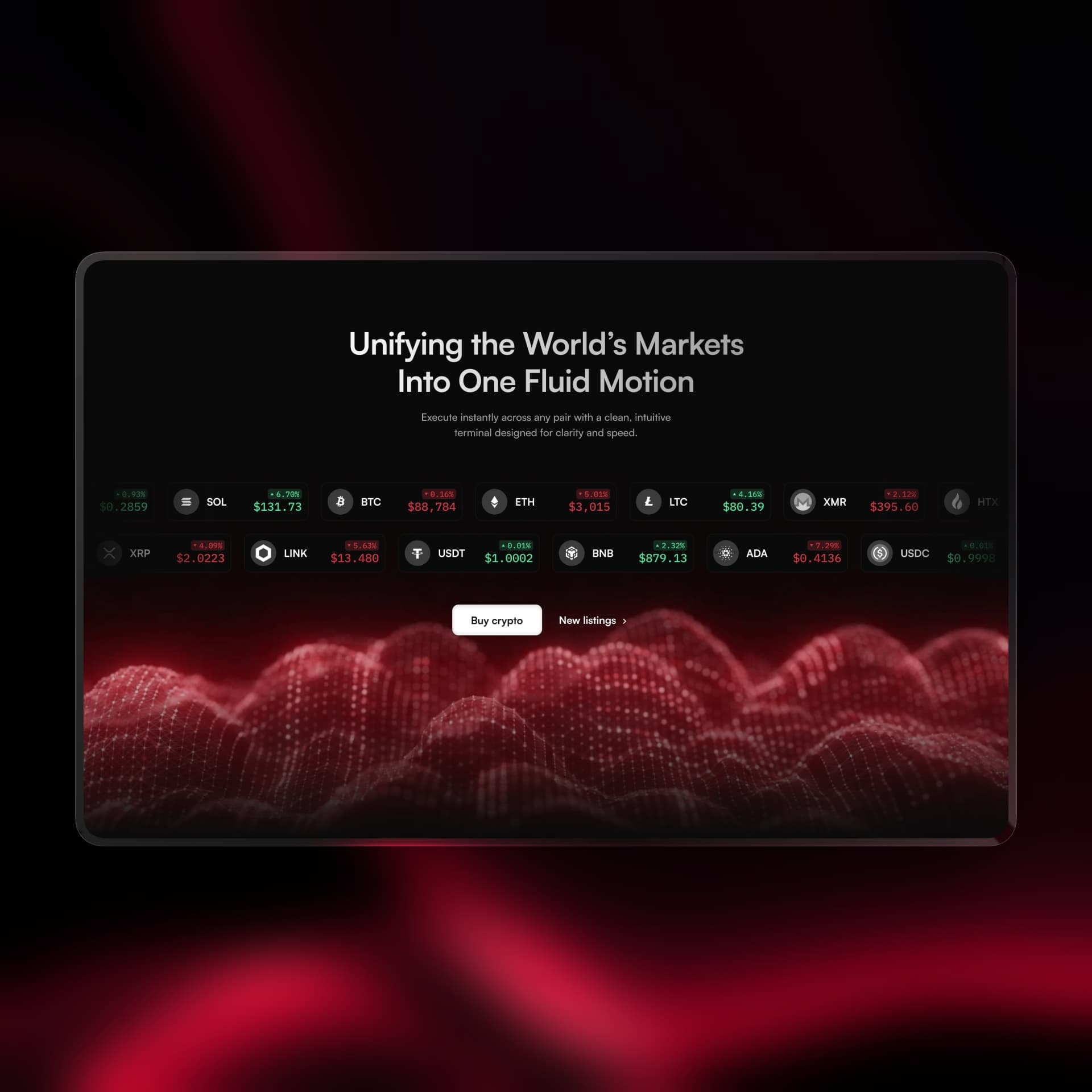
Before reading another word, the visitor sees live-looking crypto prices scrolling across the screen. No copy needed. The product speaks for itself in two seconds and establishes immediate credibility.
Both sections follow the same logic: embed the actual UI instead of describing it. A visitor can evaluate the terminal and try the swap widget before ever creating an account. The product does the selling.
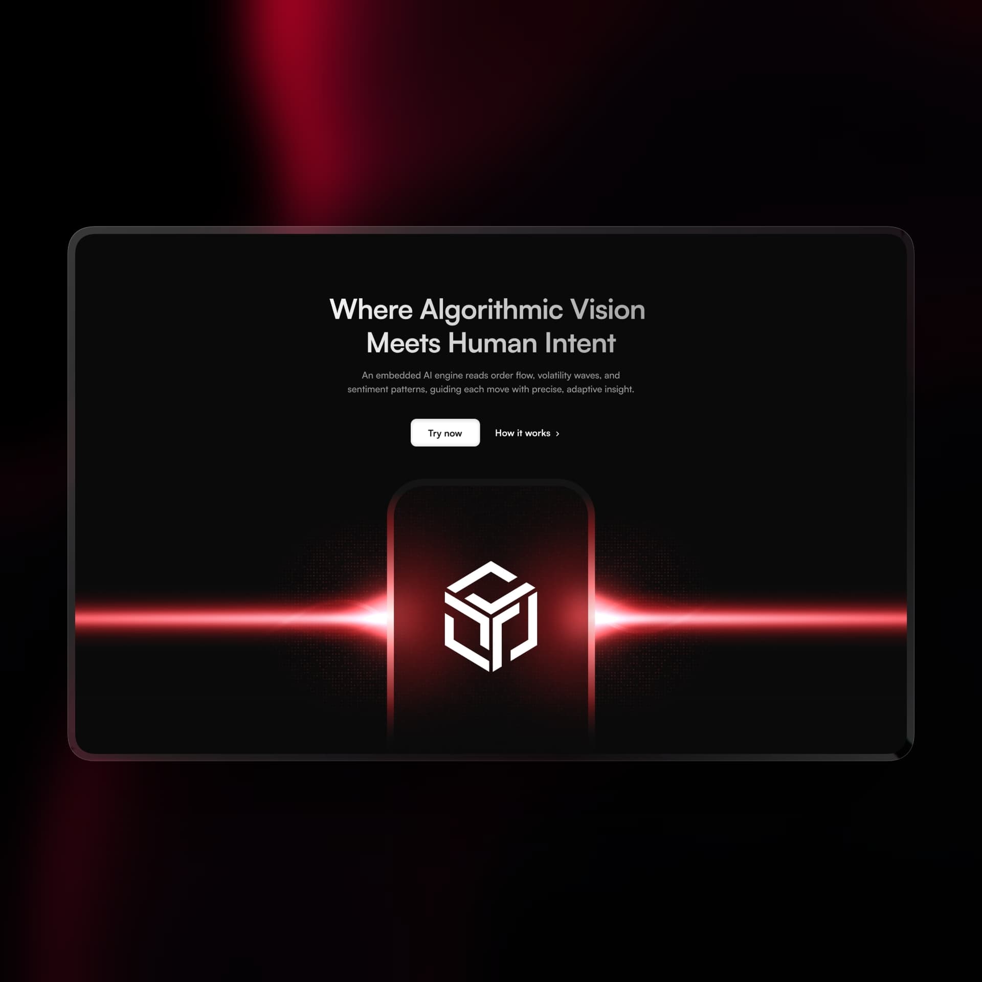
Positioned mid-page after core features have already established credibility. The AI engine lands as a natural extension of the platform rather than an overreaching claim made too early.
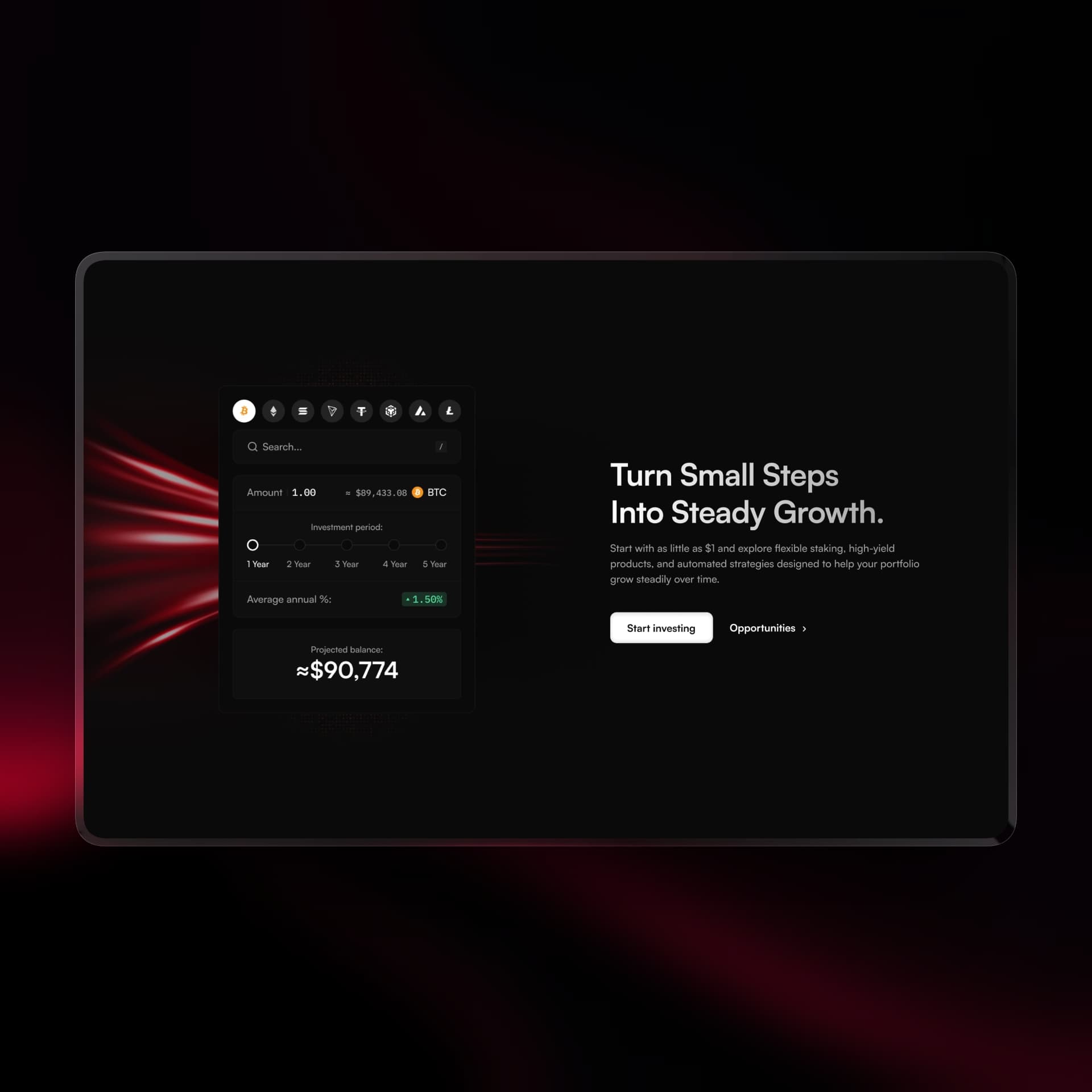
Yield percentages are abstract. A portfolio showing +$90,774 is not. The real number makes the promise feel tangible and within reach rather than theoretical.
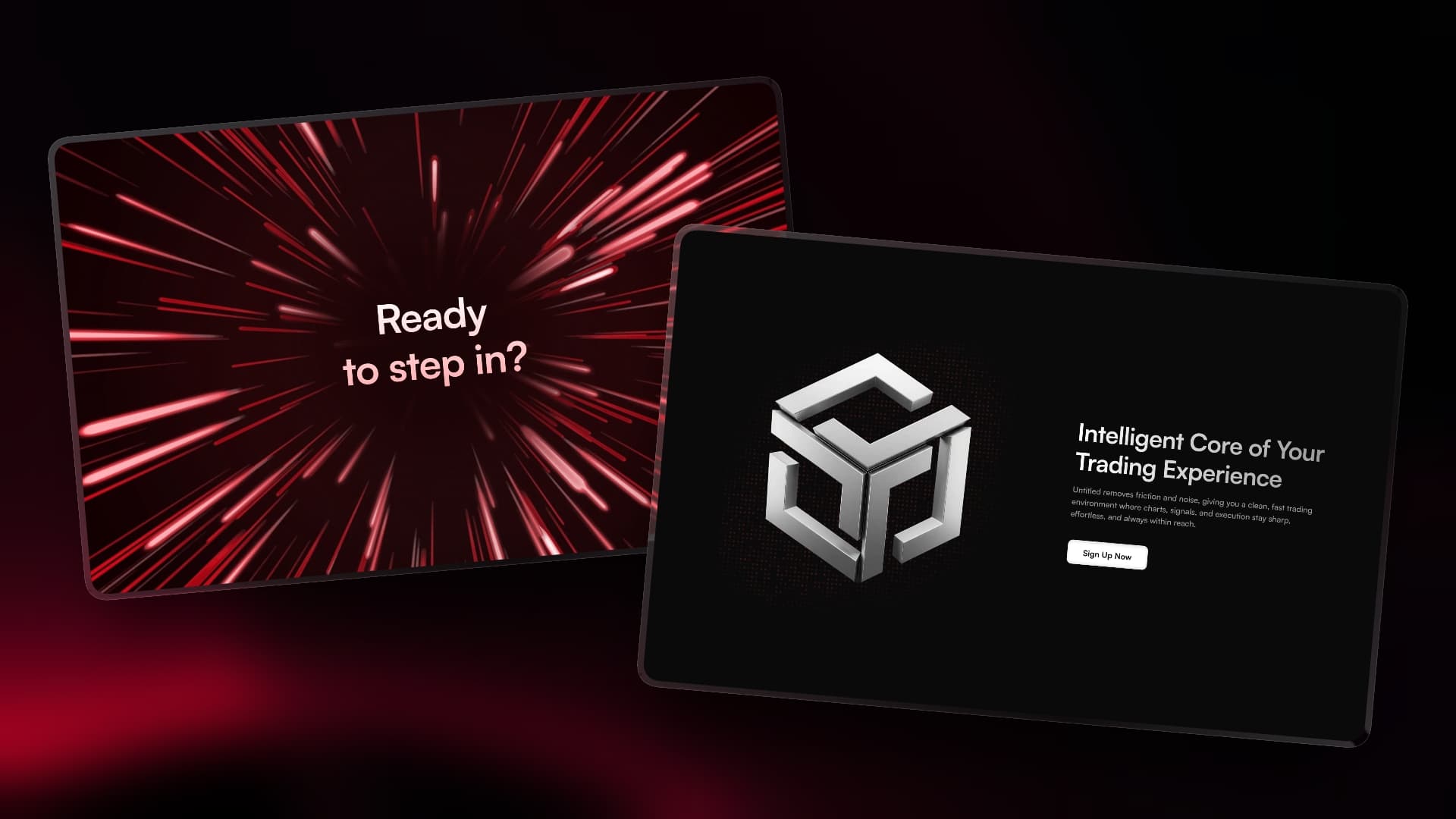
A moment of brand confidence. The metallic 3D logo takes center stage with copy about removing friction from trading. No feature list, no promises. Just the brand speaking directly.
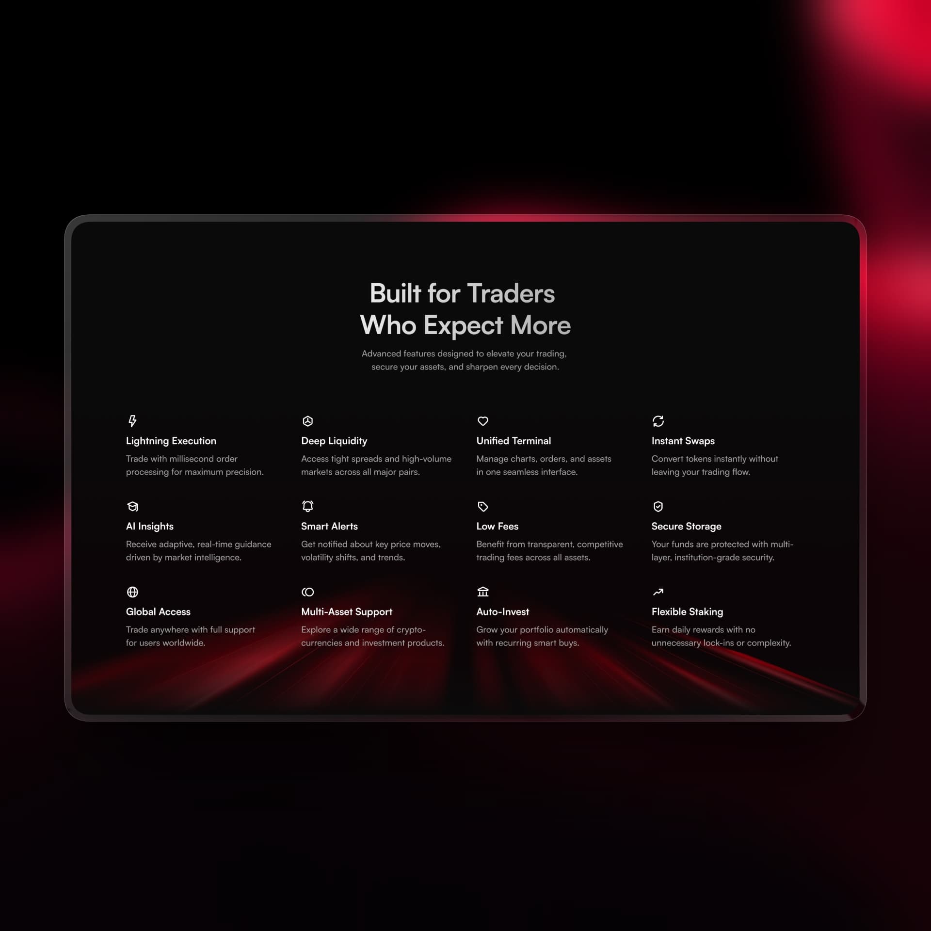
12 features presented after all emotional sections. By this point the visitor is already interested. The grid satisfies the logical part of the decision with concrete capability proof.
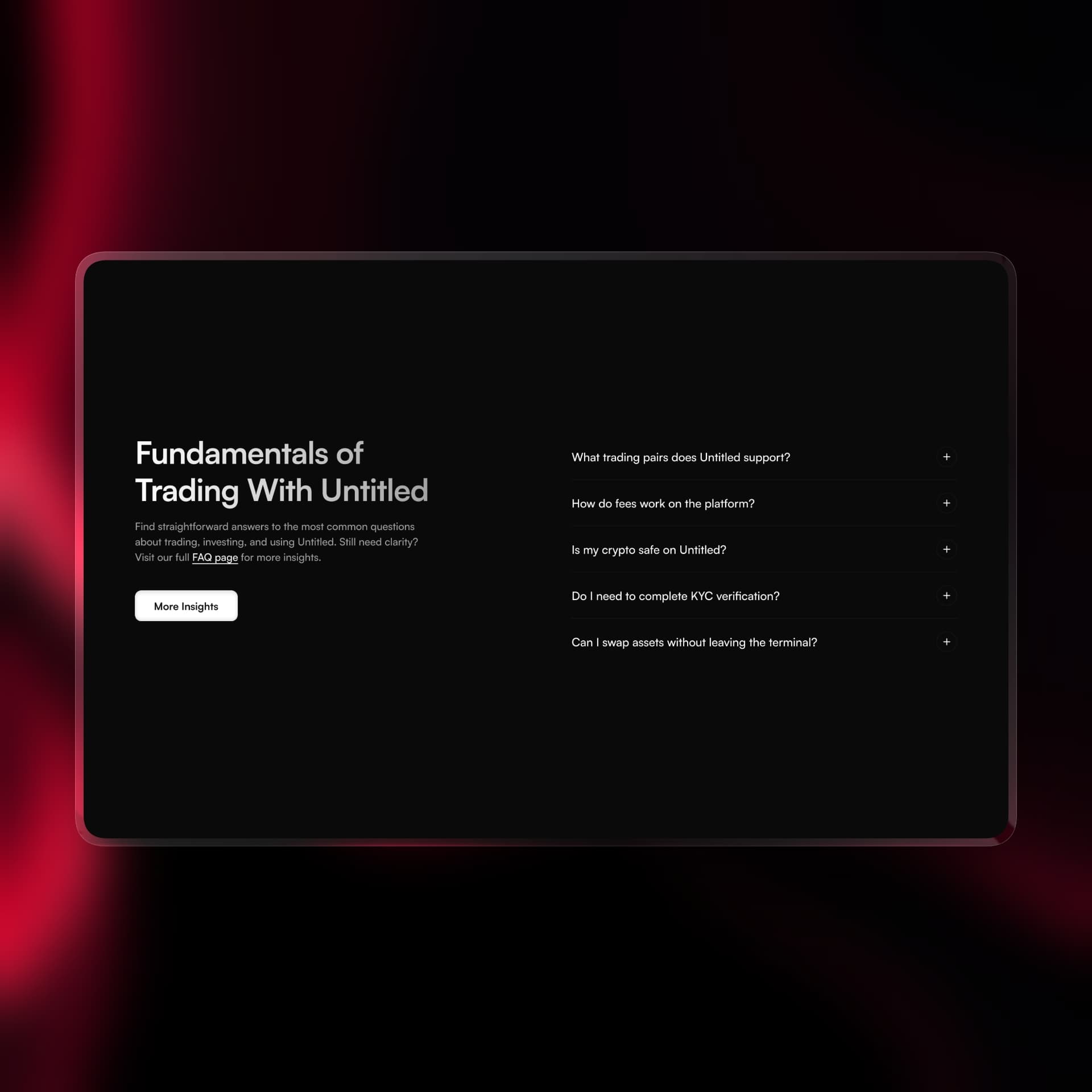
Five questions covering trading pairs, fees, security, KYC, and swaps. Removes final objections at the point where a visitor is closest to signing up.
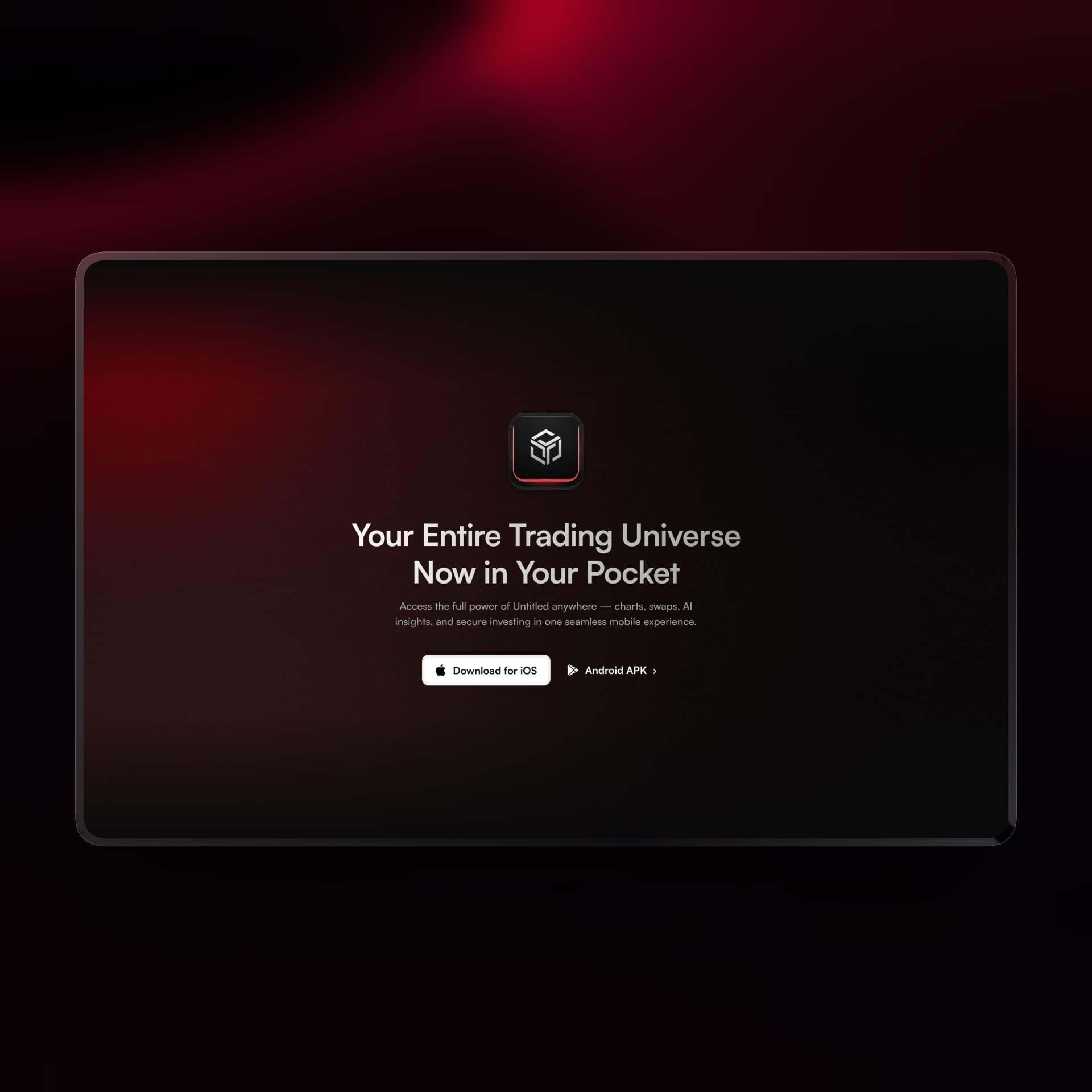
The page closes by removing the last remaining barrier. The full platform is available anywhere, on any device. A final nudge for visitors who are convinced but not yet ready to sit at a desktop.
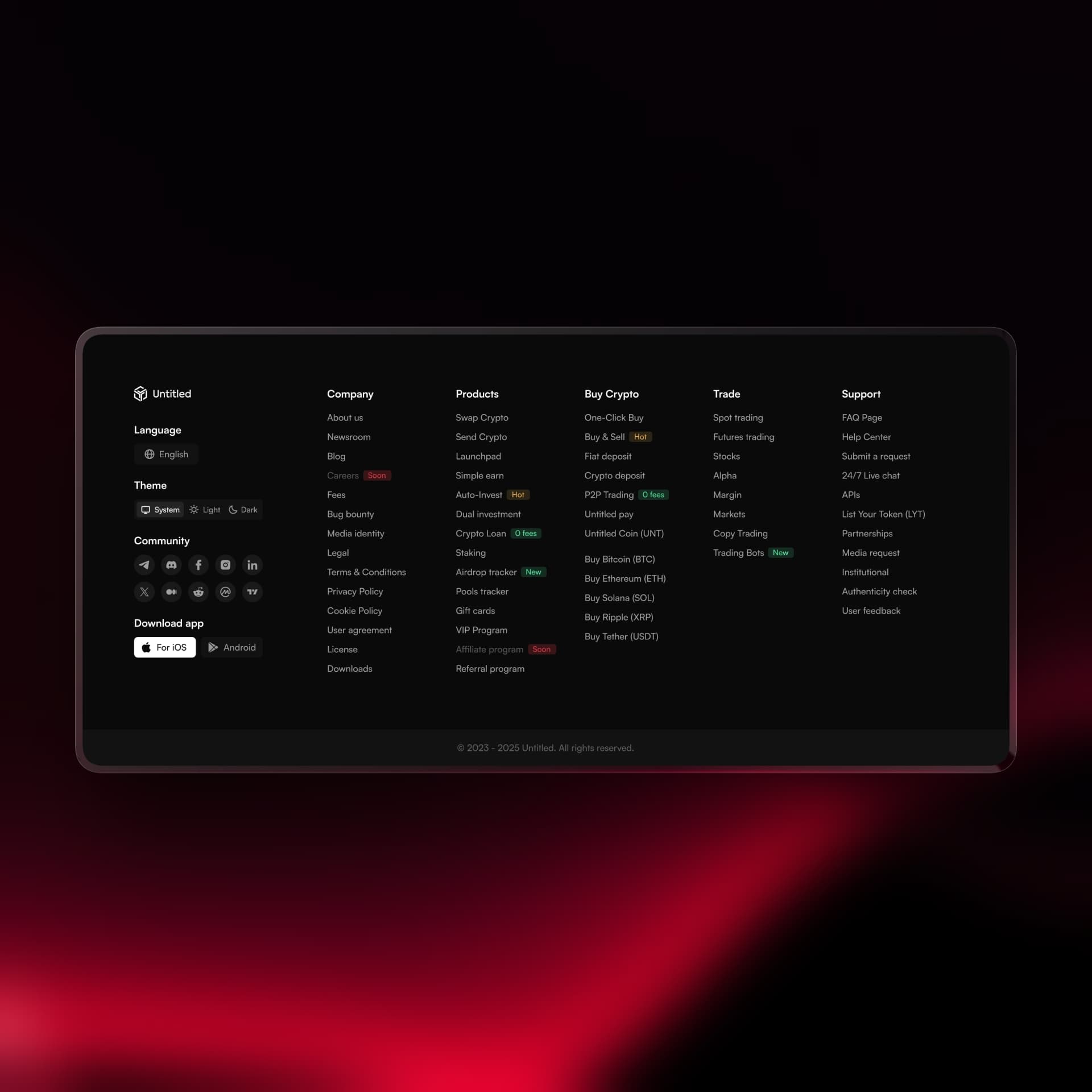
The footer is a product in itself. Six columns covering every product, feature, and support option with badge labels communicating status at a glance. A visitor scrolling the footer discovers capabilities they did not know existed.
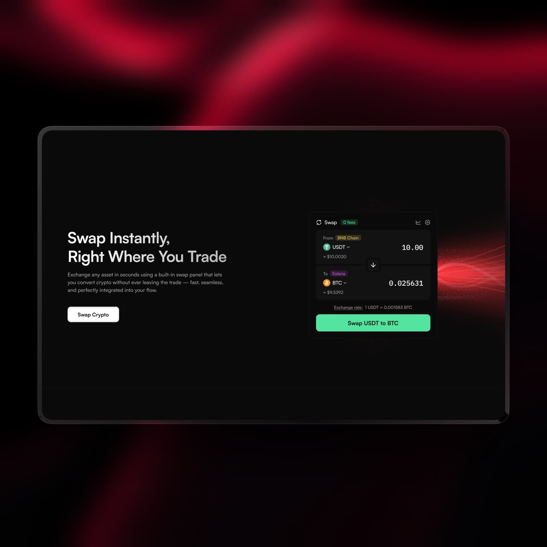
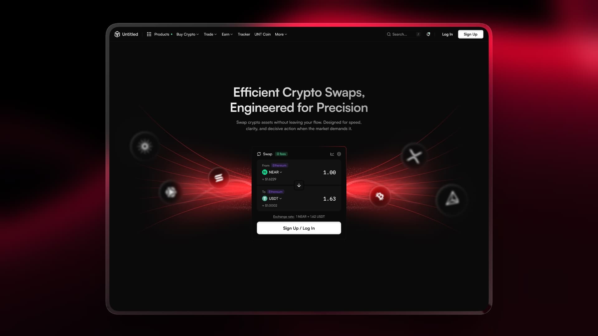
One page. One feature. Nothing else.
The swap page is the most restrained screen in the project. No secondary sections, no feature lists, no distractions. Just a headline, a widget, and a single CTA. This was a deliberate choice. The swap feature itself is fast and frictionless. A page that buried it in marketing copy would contradict everything the feature stands for. The design had to match the product's character.
The widget is the page. Visitors arrive, see exactly what Untitled offers, and make a decision. No scrolling required, no questions left unanswered.
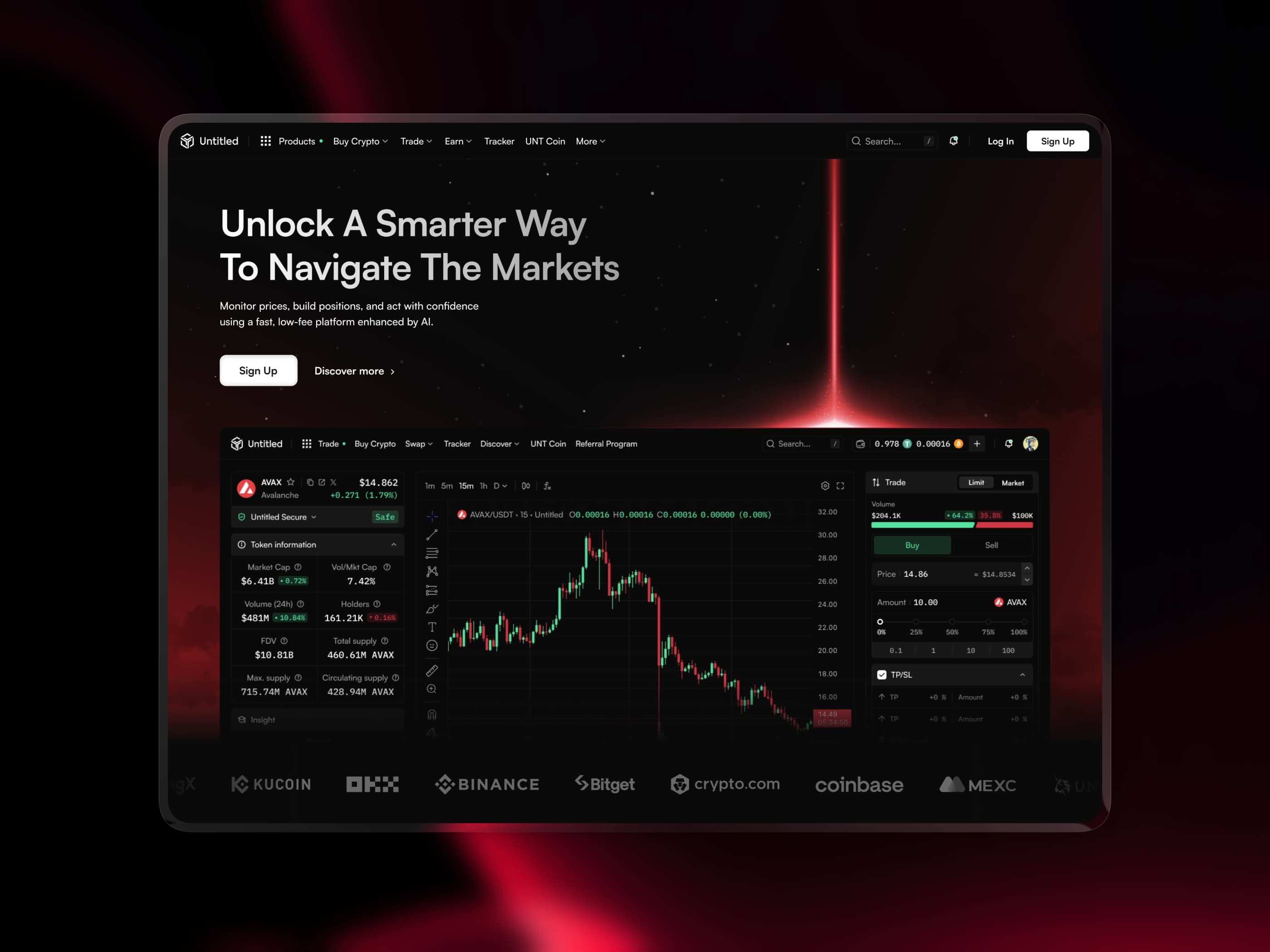
A terminal built around the moment of decision
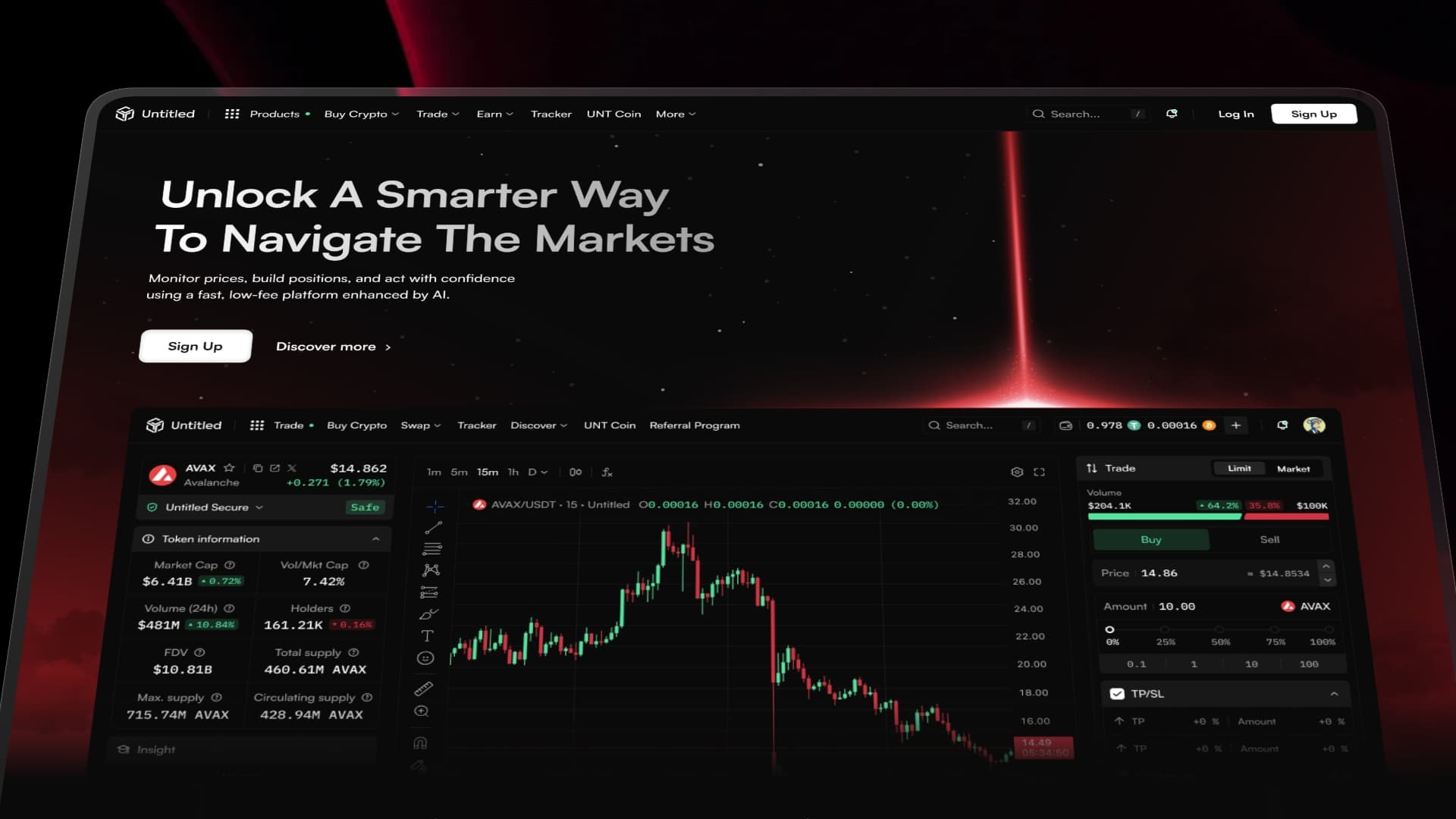
The trading terminal is the most technically complex screen in the project. Four panels, dozens of data points, real-time information updating constantly. The challenge was not fitting everything in. It was making sure nothing got in the way.
The layout follows the natural decision flow of a trader. You identify an asset, read the market, form a view, and execute. Each panel supports exactly one stage of that process.
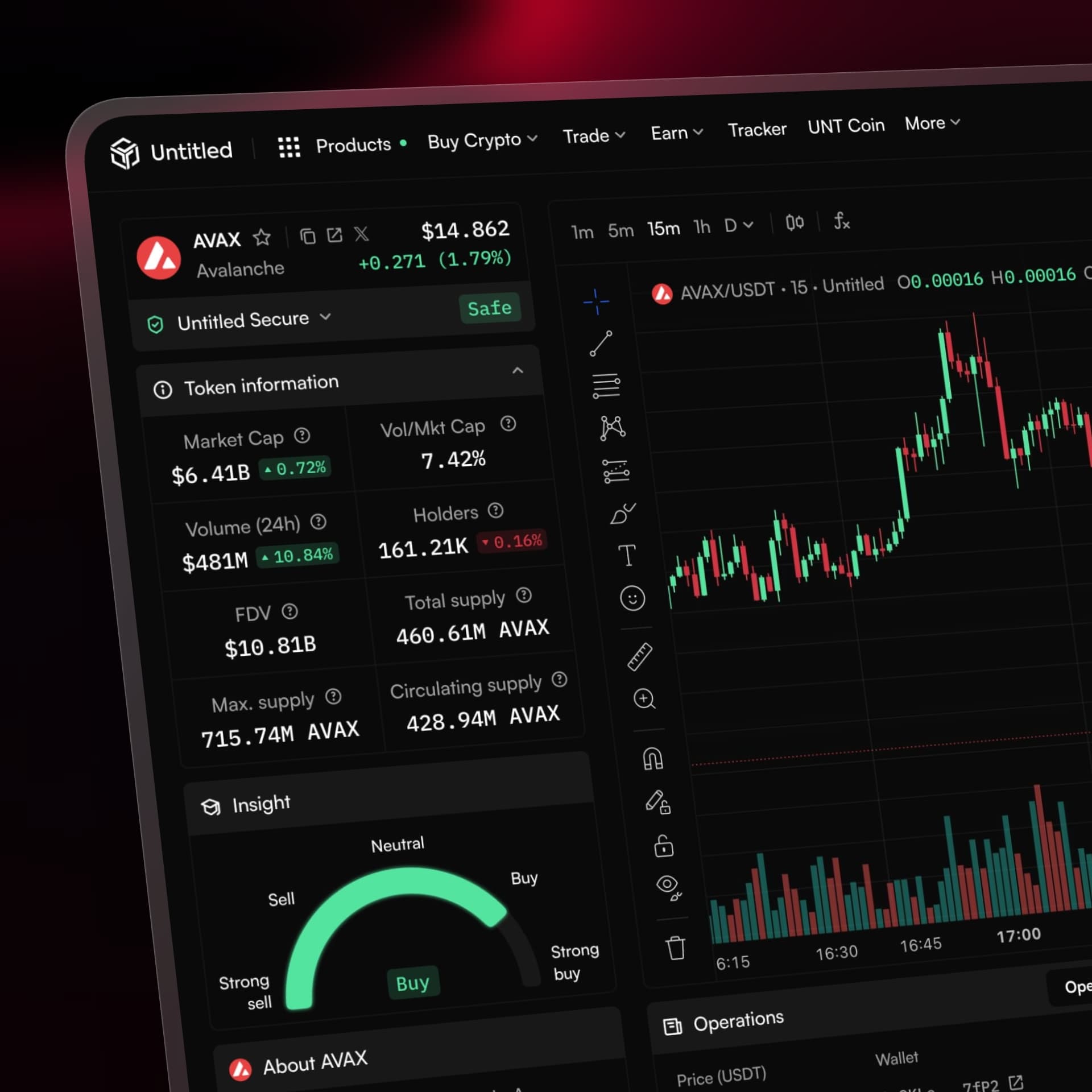
Token information, market cap, volume, holders, circulating supply. Everything a trader needs to evaluate an asset before committing. The AI sentiment gauge sits here too, giving a directional signal without prescribing a decision.

The candlestick chart takes the largest share of screen real estate because it deserves it. Timeframe selector, drawing tools, OHLC readout. A full professional charting surface that feels clean rather than cluttered.
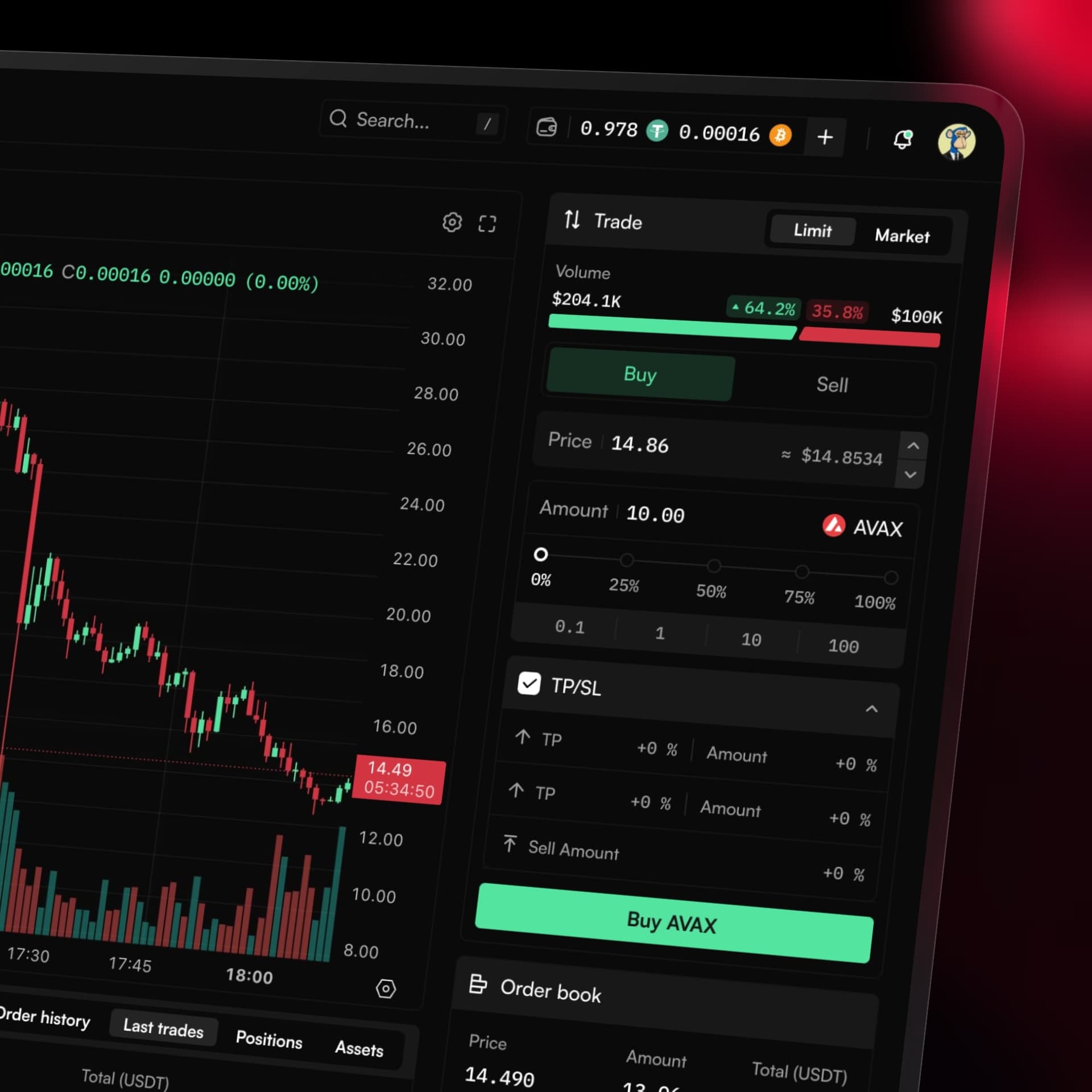
Limit and market order types, buy and sell toggle, price and amount inputs, percentage quick select, and TP/SL management. Every control a trader needs to place an order precisely, organized so the Buy button is always the most prominent element.
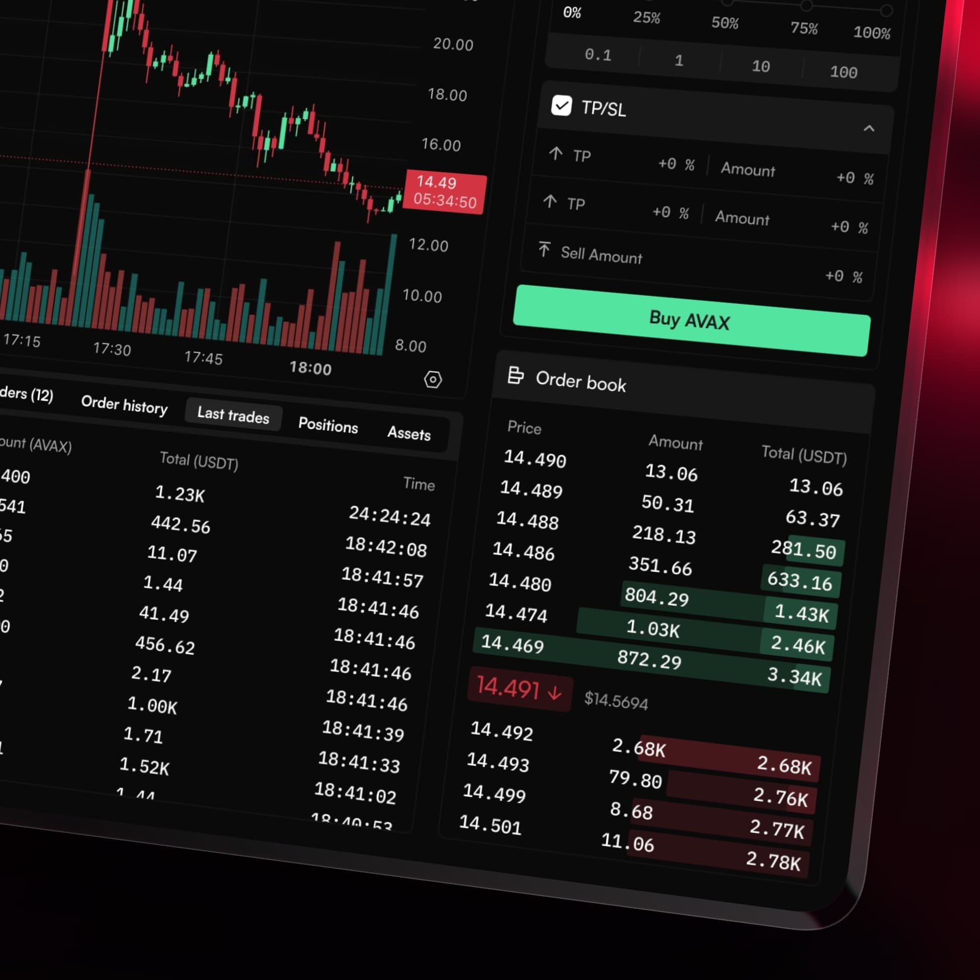
Ask and bid sides color coded red and green. Mid price displayed prominently. Depth scale selector at the bottom. The order book communicates market pressure at a glance without requiring interpretation.
What this project taught me
Designing a complex financial product forces a kind of discipline that simpler projects do not. Every element on screen competes for attention with real money on the line. There is no room for decoration that does not serve a purpose, no tolerance for ambiguity in a CTA, no space for a layout that makes a trader hesitate at the wrong moment.
Working across surfaces as different as a marketing homepage, a single-feature page, and a full trading terminal changed how I think about consistency. It is not about making everything look the same. It is about making every screen feel like it belongs to the same product while serving a completely different user need.
The homepage needs to persuade. The swap page needs to reassure. The terminal needs to perform. Designing all of them with one visual language but distinct purposes sharpened my understanding of what coherent product design actually means across a complex ecosystem.
Looking for a strategic product design partner?
Available for new engagements in 2026. I help growing teams and companies design scalable digital products built on trust, clarity, and performance.